You have to be the change to bring the change.
Color Theory – All You Need to Know
Our content is reader-supported. We may earn a commission if you make a purchase through one of our links.
The color theory might qualify as the single most interesting, as well as indispensable, aspect of creating art. Let alone art, colors are one of the most fundamental parts of life itself.
Color theory, in simple words, is the science and art of using colors. It encompasses everything related to colors, ranging from the different psychological effects of colors to color mixing and replication methods.
Adequate knowledge of color theory is a must-have for an artist’s journey toward success. And if you’re an artist, even if you’re just learning, you already know a lot about color theory.
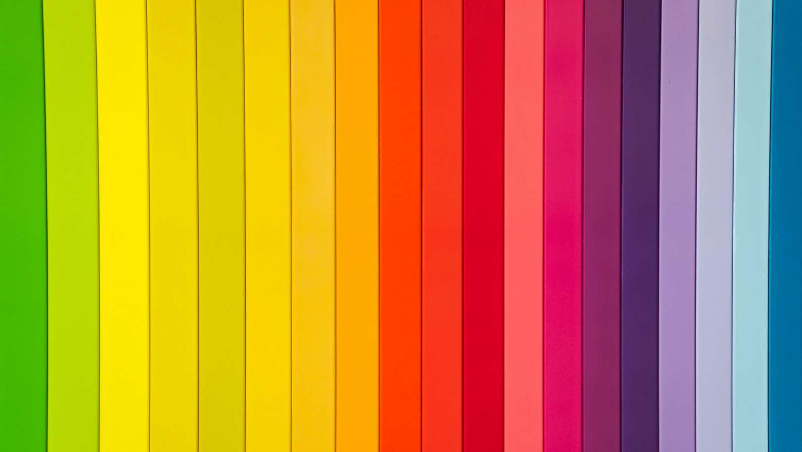
You might not know that you do, but the fact is, colors are all around us. Everything we know about colors is technically a part of the color theory, like knowing the seven colors of the rainbow or that mixing yellow and blue makes green.
But other components of color theory are not as simple and require in-depth understanding and years of art practice to fully understand and employ in your art.
So before you move on to discover the different parts of color theory, know that it’s an artist’s guide to choosing the right colors in their art, creating the right color combinations, understanding how different colors match or contrast with each other, mixing colors to create new ones, and creating harmony and cohesion in their work.
The Color Wheel
Isaac Newton developed the first color circle at the beginning of the 17th century. However, the first mentions of color theory and its related notions appeared in the work of Leone Battista and Leonardo da Vinci in the 15th century.
Newton’s color circle comprised the seven colors of the rainbow – red, orange, yellow, green, blue, indigo, and violet arranged in order on a round disc. The colors in the wheel are arranged in such a way, it enables to determine the relationship between the colors and the category each color belongs to.
Some say the color wheel is a one-image summary of the color theory, and they’re not wrong!
Primary & Secondary Colors
We usually learn about the three primary colors in pre-school – red, yellow, and blue. We often mistake the RYB (red, yellow, blue) primary colors with RGB (red, green, blue), which is the color scheme used by electronic screens to display content.
But, in the world of art and physical color pigments, red, yellow, and blue are the primary colors. The human eye even senses the three primary colors in different intensities to create colorful images in our minds. They are called primary colors because we use different combinations of these colors to produce every other color there is.
Similarly, you cannot create one of the primary colors by mixing other colors simply because it’s not possible.
Secondary colors are those which can be created by mixing equal amounts of two primary colors together. For instance, mixing red and yellow makes orange, red and blue make purple, and blue and yellow make green. Orange, purple, and green are the secondary colors in the color wheel.
Other than the six primary and secondary colors, there are also six tertiary colors that complete the 12-colored wheel. The primary colors are equally spaced from each other, making an equilateral triangle. Similarly, secondary colors also form an equilateral triangle, having equal numbers of colors between them.
Complementary Colors
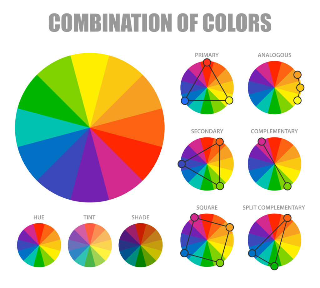
If you take a close look at the color wheel, you will see that each color has an opposite color to it, on the exact opposite side of the circle. Two colors opposing each other in the color wheel are called complementary colors.
Notice how each primary color is complemented by the combination of the other two primary colors. Interesting, right? For instance, red is complemented by green or yellow by purple.
Complimentary colors perfectly counter each other. And here’s a fun fact: two complementary colors can never create another color, only a non-color between the range of black and white. Try mixing red and green or blue and orange, and you’ll get a grayish black on your palette.
Knowing complementary colors for each color is essential for an artist. Complementary colors counter each other’s effects and create the perfect contrast. Using complementary colors in your art can make it more attention-capturing. Observe how Pop art artists use complementary colors to create art that just…pops!?
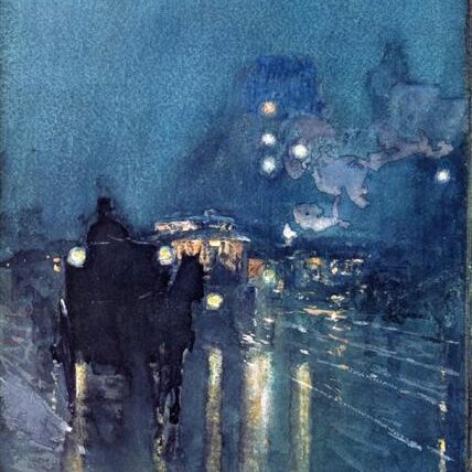
Analogous Colors
Analogous colors are sets of three colors that are found together in the color wheel. These closely bound colors provide a transitioning impression for each other and add a calming effect to the art when used together.

If you look at a particularly tranquilizing piece of art, you will notice the dominant use of analogous colors. For example, the works of Claude Monet are known for their peaceful, harmonious vibes, and here we can see how he uses analogous colors to create that effect.
In this painting, Monet focuses on using green, blue-green, and yellow-green colors to paint. Creating perfect harmony between the colors that look pacifying to look at.
Analogous colors do not present a sharp contrast to each other, but they closely follow each other and help present a more natural, easy-going, and relaxing visual.
When using an analogous color scheme, one color dominates the other two. This is usually the color that comes in the middle of the three analogous colors.
Color Temperature
Fire is red and yellow. The water is blue and green. The term color temperature refers to how cool or warm a color is. If you draw a straight line down the color wheel, you will be able to divide the warm colors from the cool ones.
This is yet another example of the perfect symmetry of the color wheel. You can differentiate all the warm colors from the cool colors with one straight line.
Warm colors contrast hard with cool ones. Warm colors, for instance, red, orange, and yellow, radiate warmth, energy, passion, or strong feelings.
Conversely, cool colors give off harmonious, relaxed, and serene vibes.
Hue, Shade, Tint, and Tone
1. Hue
Let’s talk about first things first. Hue. Hue is a synonym for color, but more specifically refers to the dominant wavelength of a specific color. In the 12-color wheel, there are 12 hues.
Hues are crucial to keep in mind when mixing two primary colors to make a secondary one. If you’re not using the exact hues of primary colors you are combining, you won’t be getting the hue of the secondary color.
The reason being a hue comprises the least amount of colors. If you mix colors that are not hues, but tints or shades, which you will learn about later, you will not be getting the hue of the resultant color. You will instead get a tint, tone, or shade.
2. Shade
Beginner artists recognize shade as the different ‘shades’ of a color. We could say this word is used to collectively refer to lighter and darker versions of a color or hue.
Technically speaking, shades are only darker versions of a hue. Different shades emerge when black is added to a hue in different proportions.
3. Tint
When you add different quantities of white to a hue, it results in various tints.
4. Tone (Saturation)
Lastly, there are different tones of a hue. A tone is created when you add both black and white to a hue. In other words, it means adding gray to color or the graying of a color.
Saturation represents the same phenomenon. Saturation is how pure a color is. De-saturating a color means the graying of a color or making a tone of a hue.
Value
Value, or tone value, refers to how light or dark a color is. It enumerates the shade or tint of a hue. Tone values hold a key role in how good a piece of art looks.
To increase or decrease the value of a color, you simply add more white or black to a hue. However, changing the value of a hue reduces the saturation of the hue and makes it less pure.
- Increasing the tone value of color means making it lighter by adding white or yellow.
- Decreasing the tone value of color means making it darker by adding black, blue, or gray.
Works of art are usually described as being high-key or low-key. The highs or lows under discussion here is the general tone value scale used in a painting.
1. High-Key Art

A high-key painting features light values. The value scale in a high-key painting is usually limited to lighter values.
Arthur Streeton’s “At Templestowe” is an example of a high-key painting. Notice there are no dark values in the artwork.
2. Low-Key Art
Low-key paintings are dominated by darker values.
The painting on the right from Childe Hassam is a low-key artwork that features strong dark values.


