You have to be the change to bring the change.
Reference Photos and How to Use Them
Our content is reader-supported. We may earn a commission if you make a purchase through one of our links.
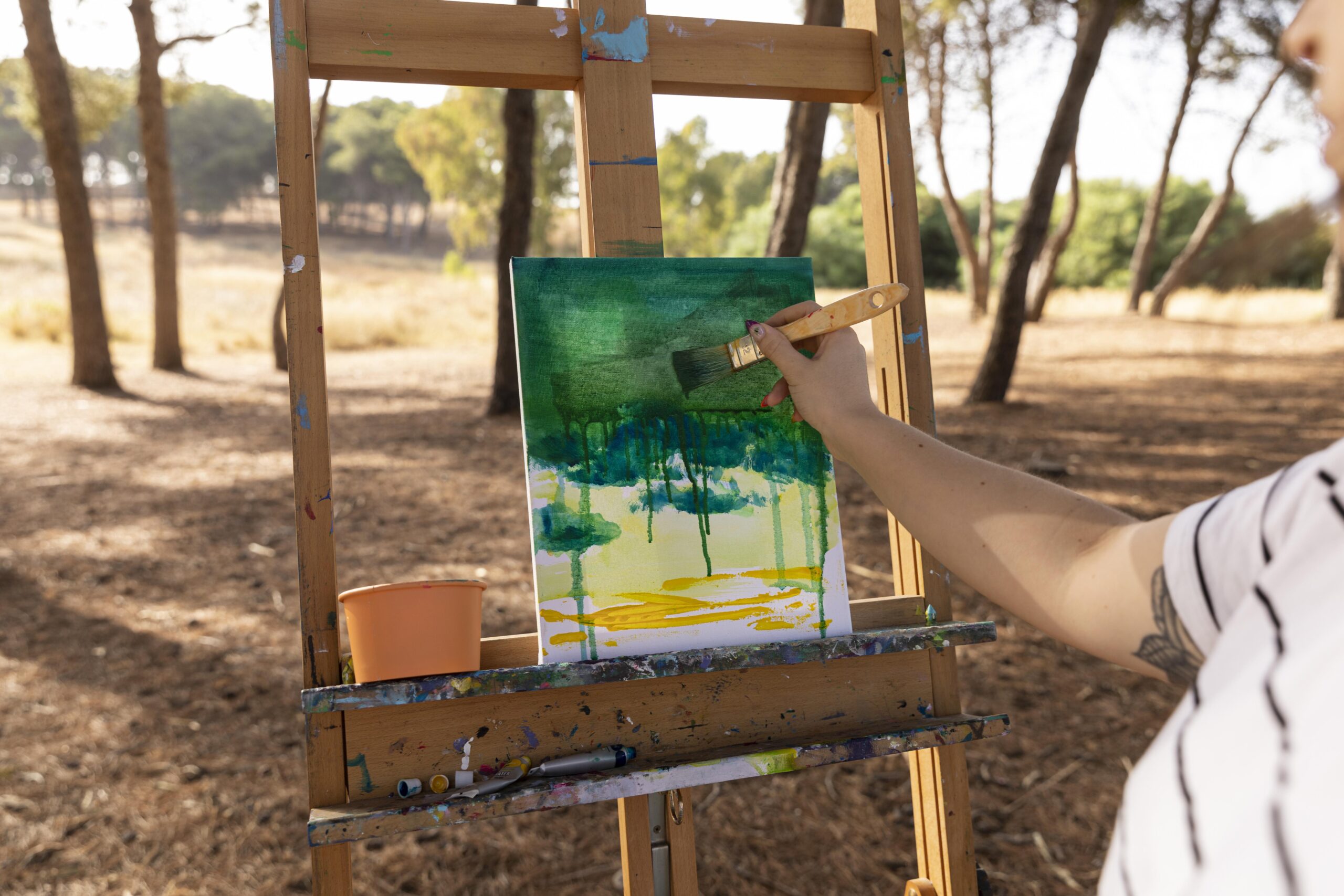
Some people condemn the entire rationale behind the use of reference photos in making art. They claim that replicating a photograph defeats the purpose of creativity and individualism in art. However, many artists find that painting from a reference photo is their stepping stone to perfecting their skills.
Be it portraits or landscapes, having a reference while you transfer the scene on the canvas can work wonders. It relieves you of the need to strain your visual memory and makes for fewer factual and logical errors in the work.
Is Using Reference Photos a Good Idea?
Suppose you are part of a study asking you to paint a hound in the woods. Firstly, it’s not an archetypical image that you can pull out of the collective human consciousness. While some may have a memory of gazing at something similar, there are high chances that most don’t. Consequently, as an artist, you may begin by picturing your subject matter. Yet, practically painting anything requires more than imagination.
You may have several questions along the lines of what a hound’s face looks like, whether its tail curls naturally, and if there is a distinct shape to its abdomen. You may also wonder about its proportions compared to the forest and how the light rays fall through the leaves and barks. Having a reference photo at hand makes all these practical considerations easier.
It leaves you with more time to experiment with tone, style, and color rather than hyper-fixating on constructing the image right. Besides, for some art mediums and styles, reference photos are an absolute necessity. Those who commission portraits are well aware of it. Although you could try painting from still-life by having people model for you, it’s not always ideal. Your model may flinch, yawn, or sneeze while you struggle to convey the posture.
While you’re creating a rendition on the canvas, a gesture as tiny as the blinking of the eye can disrupt the entire rhythm. A reference photo can save a lot of time and frustration. Having access to your art Muse in real life is fantastic, but a picture often makes for a more realistic portrayal.
Whether digital or printed, it has a two-dimensional surface, a characteristic shared by canvases. Hence, you need not worry about element placement, angles, and the tricky shift from 3D to 2D surface painting from still-life demands.
What Makes a Good Reference Photo?
We have all been through the struggle of finding that perfect photo for designing wall hangings, showing it to a friend while introducing them to our family, or even for Instagramming some memorable times. Photos are curious things this way, and the pursuit for the best one unfolds daily.
Reference photos are no exception, and if you’re going to work with one, better make sure that it’s a good one. Here are things to factor in while choosing:
Size
Expecting to paint on a 10 x 10 ft canvas using one of the images in your phone gallery will not work out well. There are high chances that you’ll find yourself wanting to zoom in while detailing the painting. But your phone may refuse to cooperate. Not to mention the inconvenience of frequently staring at a small screen in the middle of an enormous painting.
To avoid later problems, it’s best if you find a picture of proportionate size. You may also want to get prints and set them up on spare easels to cross-check while painting on canvas.
Lightning and Color
You want to ensure that your picture has adequate light and colors. It means those aesthetic photos with monochrome red or purple filters won’t suffice. Images with colors faded or washed out are also tricky to recreate, as are those over-exposed to light.
Once you have a collection of photos to choose from, assess the light and dark areas. Whether the colors exist as softly transitioning gradients or as sharply defined splashes is also essential. One trick is to perceive the color palette you will need for the painting beforehand.
Resolution
It goes without saying, but the reference photo cannot be of bad quality. Although blurry shots may make great memories to hold on to, they don’t make good reference photos. Your image should be sufficiently sharp so that you can distinguish the line and form in your painting.
Sometimes, blurry and more sensitive regions coexist in a photo. Your choice may also depend on the level of detail you’re looking to embed in your painting.
Angle
Among other things, the angle and positioning of the subject are of vital importance. For instance, if it’s a portrait, it is best to avoid a frontal photograph if you intend to paint the frontal view of the face. Also, speculate how the subject matter will look in the space on the canvas.
Will it leave any room for background, or will your main subject block the viewer’s eye from wandering into spaces overhead? The use of linear or atmospheric perspective can decide how you deal with the negative space and whether it’s well-balanced in the composition.
How to Transfer the Image Using the Reference Photo?
You have picked the best reference photo, but how do you go about shifting it to your canvas or sketch pad? There are various methods to it. The most basic one is to go freehand with your good old pencils. Begin with a rough sketch before adding the details, and you may use geometric tools to help you with proportions.
A better way of transferring is using a grid that divides the photo into multiple, tiny squares. Plenty of photoshop tools will allow you to do that, and it breaks your work into smaller, manageable chunks. Yet another feasible method is using a transfer paper. It can work equally well on a canvas.
You may utilize a pen, stylus, or a pencil of high grade to trace over the wax-free paper. The lines you sketch will neatly transfer to the canvas. Once the basic drawing is in place, you can begin painting with your preferred medium.


